Branding
Branding
About Me
About me

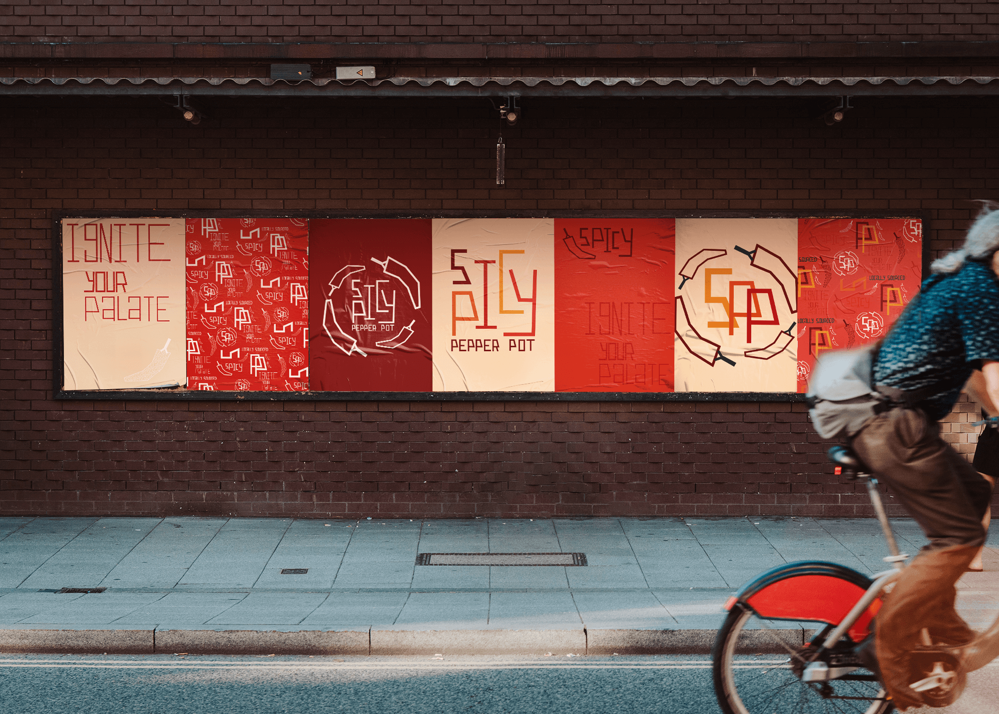
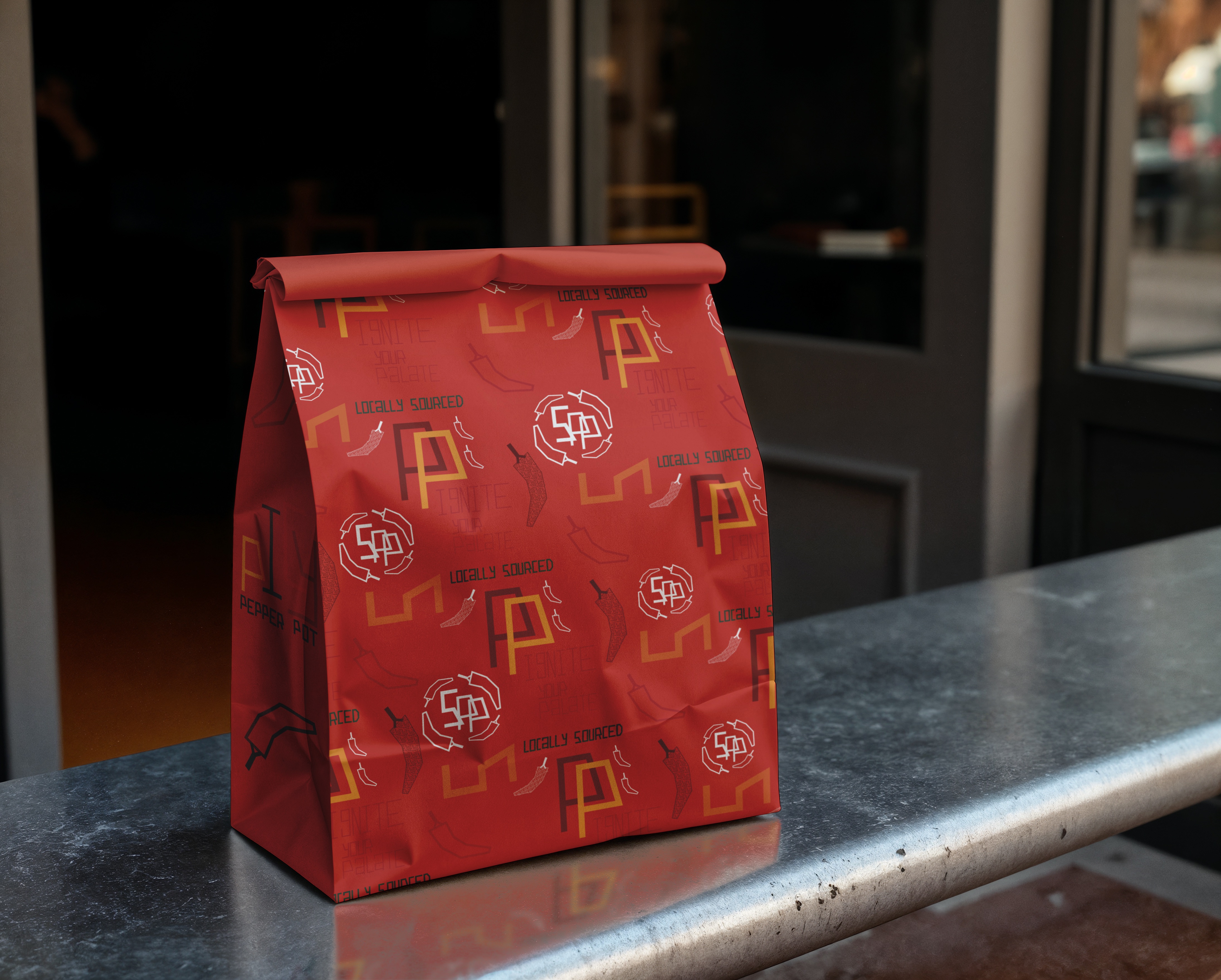
The identity system for the hypothetical takeout Thai restaurant, 'Spicy Pepper Pot,' employs simple lines and angles that evolve into complex collateral. This system includes multiple alternate logos and pattern designs for packaging, signage and menus. Featuring a warm color palette of bold reds and oranges, the identity also incorporates a custom typeface, adding a unique touch to the brand.
2024
Art Director: Scott Gladd

Main Logo

Alternate Marks

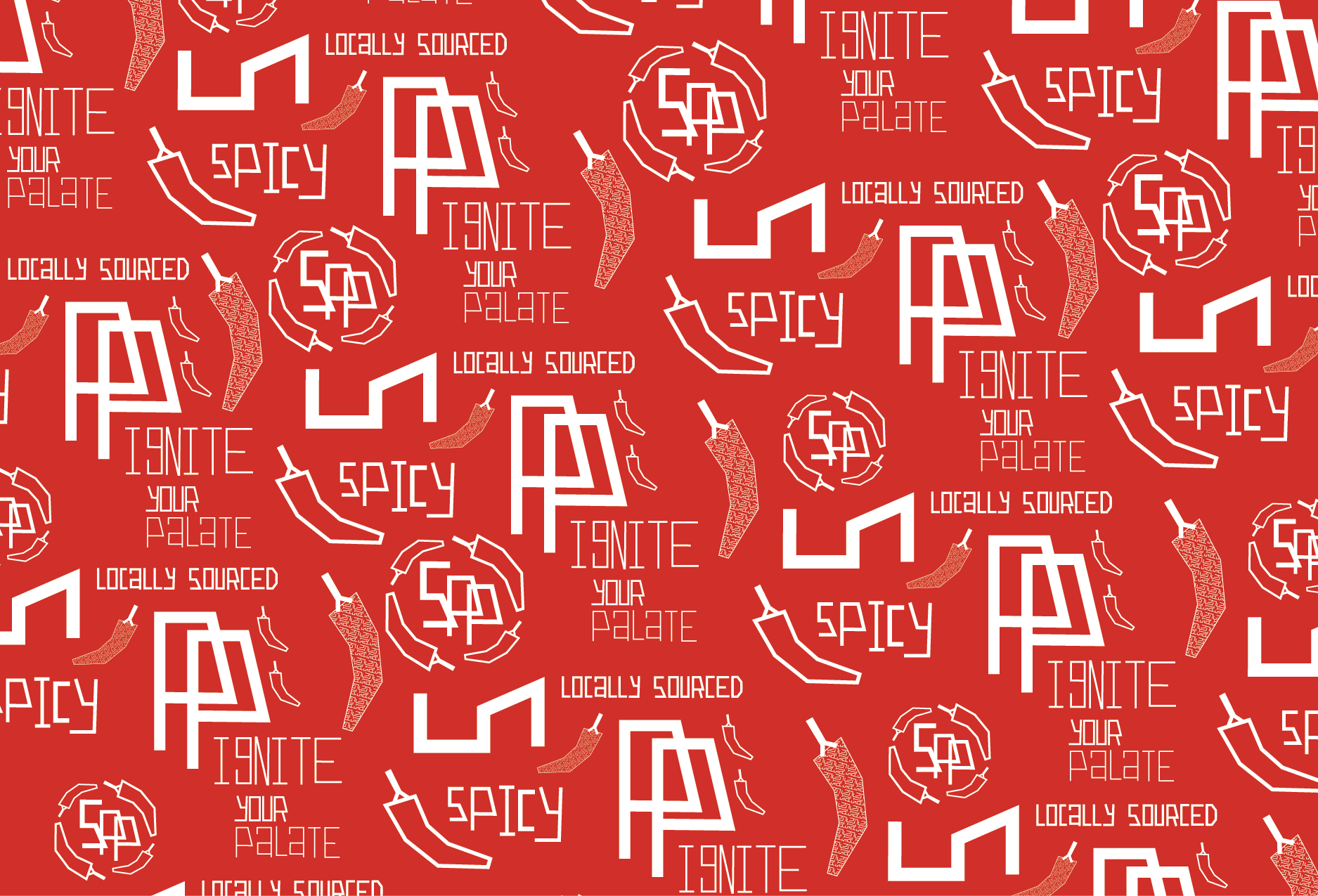
Brand Patterns


For the Spicy Pepper Pot logo, I began by sketching out different ways to write the name. I experimented with various styles and played around with making the layout more dynamic and less straightforward. I also explored incorporating different icons—like an elephant—to see how they might enhance the overall design. The word “spicy” became a focal point for creative exploration,
as I tested out unique ways to style and position it
within the logo.
Once I landed on a layout for the word “spicy,” the focus shifted to finding the right style to bring it to life. I initially explored a soft, rounded typeface that gave the word a playful warmth, but eventually transitioned to stronger, more structured rectangular lines that felt bolder and more grounded. From there, I turned my attention to the secondary type—“pepper pot”—experimenting with its placement and styling to create balance and flow within the overall composition.
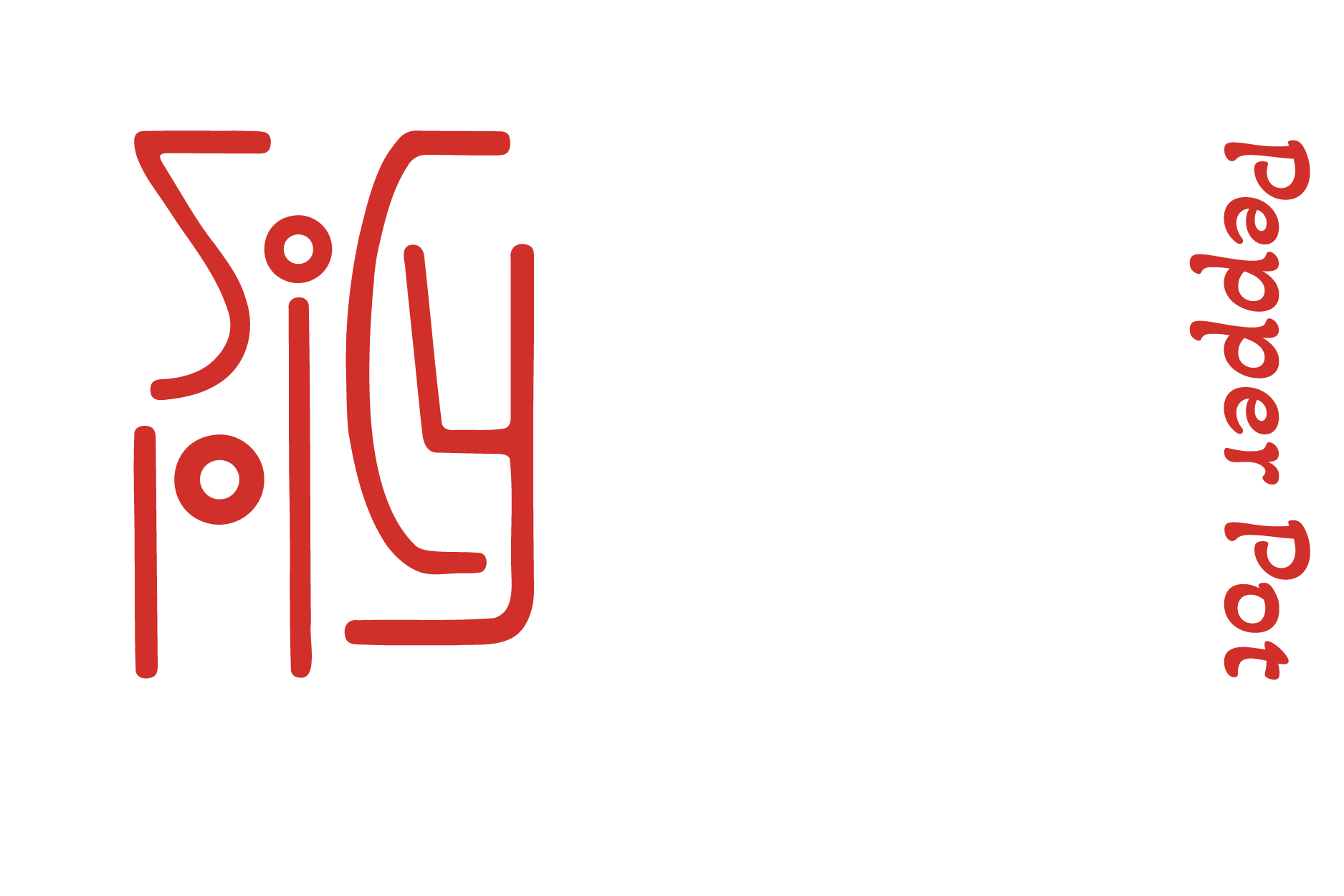
All of that exploration led to the final version—a structured, linear design that offers versatility and clarity. Its clean, bold lines lend themselves well to a wide range of applications, making it ideal for the many marks a restaurant might need. Beyond just a logo, the design naturally evolved into a visual system, translating beautifully into patterns that can appear throughout the restaurant—from packaging to signage to other brand touchpoints. It became more than just a logo—it became a visual language.


